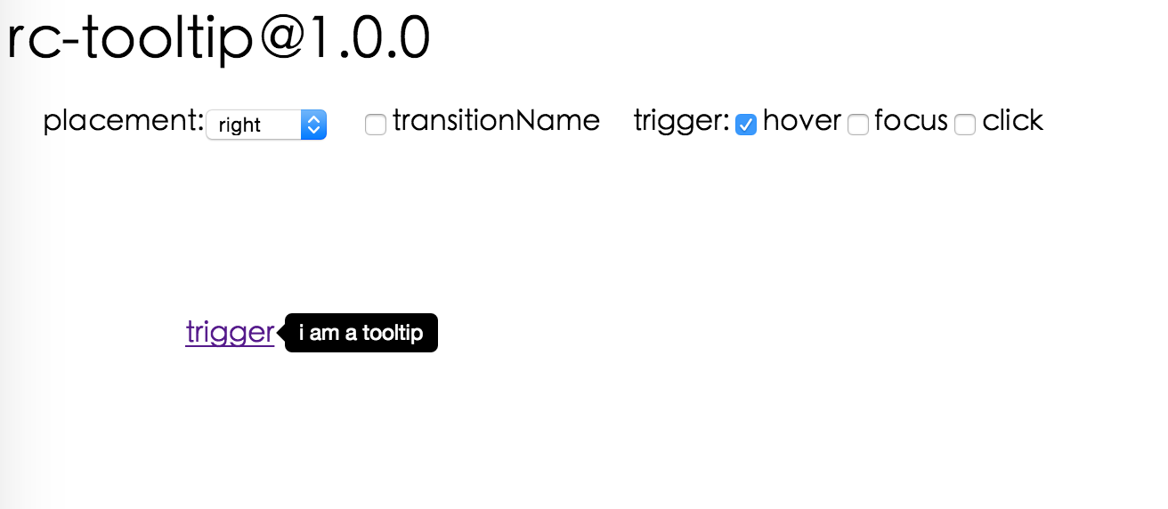
# rc-tooltip **Repository Path**: mirrors_fis-components/rc-tooltip ## Basic Information - **Project Name**: rc-tooltip - **Description**: Fork from https://github.com/react-component/tooltip.git - **Primary Language**: Unknown - **License**: Not specified - **Default Branch**: master - **Homepage**: None - **GVP Project**: No ## Statistics - **Stars**: 0 - **Forks**: 0 - **Created**: 2020-08-08 - **Last Updated**: 2026-11-07 ## Categories & Tags **Categories**: Uncategorized **Tags**: None ## README # rc-tooltip --- tooltip ui component for react 0.14+ [![NPM version][npm-image]][npm-url] [![build status][travis-image]][travis-url] [![Test coverage][coveralls-image]][coveralls-url] [![gemnasium deps][gemnasium-image]][gemnasium-url] [![node version][node-image]][node-url] [![npm download][download-image]][download-url] [![Sauce Test Status](https://saucelabs.com/buildstatus/rc-tooltip)](https://saucelabs.com/u/rc-tooltip) [npm-image]: http://img.shields.io/npm/v/rc-tooltip.svg?style=flat-square [npm-url]: http://npmjs.org/package/rc-tooltip [travis-image]: https://img.shields.io/travis/react-component/tooltip.svg?style=flat-square [travis-url]: https://travis-ci.org/react-component/tooltip [coveralls-image]: https://img.shields.io/coveralls/react-component/tooltip.svg?style=flat-square [coveralls-url]: https://coveralls.io/r/react-component/tooltip?branch=master [gemnasium-image]: http://img.shields.io/gemnasium/react-component/tooltip.svg?style=flat-square [gemnasium-url]: https://gemnasium.com/react-component/tooltip [node-image]: https://img.shields.io/badge/node.js-%3E=_0.10-green.svg?style=flat-square [node-url]: http://nodejs.org/download/ [download-image]: https://img.shields.io/npm/dm/rc-tooltip.svg?style=flat-square [download-url]: https://npmjs.org/package/rc-tooltip ## Screenshots ## Feature * support ie8,ie8+,chrome,firefox,safari ## install [![rc-tooltip](https://nodei.co/npm/rc-tooltip.png)](https://npmjs.org/package/rc-tooltip) ## Usage ```js var Tooltip = require('rc-tooltip'); var React = require('react'); var ReactDOM = require('react-dom') ReactDOM.render(tooltip}>hover, container); ``` ## Example http://localhost:8007/examples online example: http://react-component.github.io/tooltip/examples/ ## API ### props
name type default description
overlayClassName string additional className added to popup overlay
trigger string[] ['hover'] which actions cause tooltip shown. enum of 'hover','click','focus'
mouseEnterDelay number 0 delay time to show when mouse enter.unit: s.
mouseLeaveDelay number 0.1 delay time to hide when mouse leave.unit: s.
overlayStyle Object additional style of overlay node
prefixCls String rc-tooltip prefix class name
transitionName String same as https://github.com/react-component/css-transition-group
onVisibleChange Function call when visible is changed
visible boolean whether tooltip is visible
defaultVisible boolean whether tooltip is visible initially
placement String|Object one of ['left','right','top','bottom', 'topLeft', 'topRight', 'bottomLeft', 'bottomRight'] or alignConfig of [dom-align](https://github.com/yiminghe/dom-align)
align Object: alignConfig of [dom-align](https://github.com/yiminghe/dom-align) only valid when placement's type is String. value will be merged into placement's align config. note: can only accept offset and targetOffset
overlay React.Element popup content
arrowContent React.Node null arrow content
getTooltipContainer function function returning html node which will act as tooltip contaier
destroyTooltipOnHide boolean false whether destroy tooltip when tooltip is hidden
## Development ``` npm install npm start ``` ## Test Case http://localhost:8007/tests/runner.html?coverage ## Coverage http://localhost:8007/node_modules/rc-server/node_modules/node-jscover/lib/front-end/jscoverage.html?w=http://localhost:8007/tests/runner.html?coverage ## License rc-tooltip is released under the MIT license.