# rc-tree-select
**Repository Path**: mirrors_fis-components/rc-tree-select
## Basic Information
- **Project Name**: rc-tree-select
- **Description**: Fork from https://github.com/react-component/tree-select.git
- **Primary Language**: Unknown
- **License**: Not specified
- **Default Branch**: master
- **Homepage**: None
- **GVP Project**: No
## Statistics
- **Stars**: 0
- **Forks**: 0
- **Created**: 2020-08-08
- **Last Updated**: 2026-11-07
## Categories & Tags
**Categories**: Uncategorized
**Tags**: None
## README
# rc-tree-select
---
React TreeSelect Component
[![NPM version][npm-image]][npm-url]
[![build status][travis-image]][travis-url]
[![Test coverage][coveralls-image]][coveralls-url]
[![gemnasium deps][gemnasium-image]][gemnasium-url]
[![npm download][download-image]][download-url]
[npm-image]: http://img.shields.io/npm/v/rc-tree-select.svg?style=flat-square
[npm-url]: http://npmjs.org/package/rc-tree-select
[travis-image]: https://img.shields.io/travis/react-component/tree-select.svg?style=flat-square
[travis-url]: https://travis-ci.org/react-component/tree-select
[coveralls-image]: https://img.shields.io/coveralls/react-component/tree-select.svg?style=flat-square
[coveralls-url]: https://coveralls.io/r/react-component/tree-select?branch=master
[gemnasium-image]: http://img.shields.io/gemnasium/react-component/tree-select.svg?style=flat-square
[gemnasium-url]: https://gemnasium.com/react-component/tree-select
[node-image]: https://img.shields.io/badge/node.js-%3E=_0.10-green.svg?style=flat-square
[node-url]: http://nodejs.org/download/
[download-image]: https://img.shields.io/npm/dm/rc-tree-select.svg?style=flat-square
[download-url]: https://npmjs.org/package/rc-tree-select
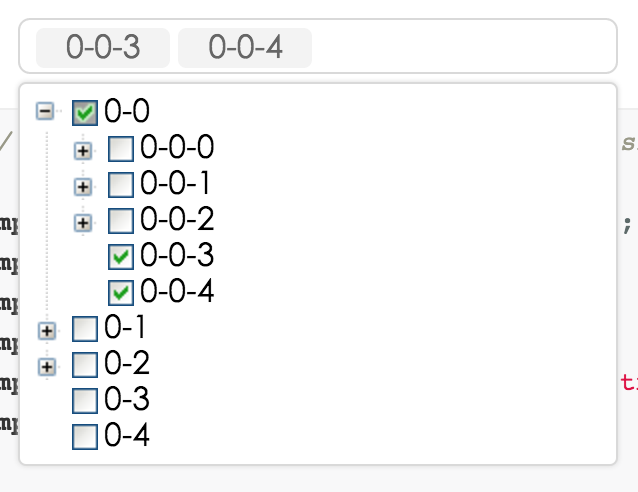
## Screenshots
 ## Development
```
npm install
npm start
```
## Example
http://localhost:8000/examples/
online example: http://react-component.github.io/tree-select/
## install
[](https://npmjs.org/package/rc-tree-select)
## API
### TreeSelect props
| name | description | type | default |
|----------|----------------|----------|--------------|
|className | additional css class of root dom node | String | '' |
|prefixCls | prefix class | String | '' |
|animation | dropdown animation name. only support slide-up now | String | '' |
|transitionName | dropdown css animation name | String | '' |
|choiceTransitionName | css animation name for selected items at multiple mode | String | '' |
|dropdownMatchSelectWidth | whether dropdown's with is same with select | bool | true |
|dropdownClassName | additional className applied to dropdown | String | - |
|dropdownStyle | additional style applied to dropdown | Object | {} |
|dropdownPopupAlign | specify alignment for dropdown | Object | - |
|notFoundContent | specify content to show when no result matches. | String | 'Not Found' |
|showSearch | whether show search input in single mode | bool | true |
|allowClear | whether allowClear | bool | false |
|tags | when tagging is enabled the user can select from pre-existing options or create a new tag by picking the first choice, which is what the user has typed into the search box so far. | bool | false |
|maxTagTextLength | max tag text length to show | number | - |
|combobox | enable combobox mode(can not set multiple at the same time) | bool | false |
|multiple | whether multiple select | bool | false |
|disabled | whether disabled select | bool | false |
|defaultValue | initial selected option(s) | String/Array | - |
|value | current selected option(s) | String/Array | - |
|onChange | called when select treeNode or input value change(combobox) | function(value, label) | - |
|onSelect | called when select treeNode | function(value, node) | - |
|onSearch | called when input changed | function | - |
|showCheckedStrategy | `TreeSelect.SHOW_ALL`: show all checked treeNodes (Include parent treeNode). `TreeSelect.SHOW_PARENT`: show checked treeNodes (Just show parent treeNode). Default just show child. | enum{TreeSelect.SHOW_ALL, TreeSelect.SHOW_PARENT, TreeSelect.SHOW_CHILD } | TreeSelect.SHOW_CHILD |
|treeIcon | show tree icon | bool | false |
|treeLine | show tree line | bool | false |
|treeDefaultExpandAll | default expand all treeNode | bool | false |
|treeCheckable | whether tree show checkbox (select callback will not fire) | bool | false |
|filterTreeNode | filter some treeNodes as you need. it should return true | function(treeNode) | - |
|treeNodeFilterProp | which prop value of treeNode will be used for filter if filterTreeNode return true | String | 'value' |
|treeNodeLabelProp | which prop value of treeNode will render as content of select | String | 'title' |
|treeData | treeNodes data Array, if set it then you need not to construct children TreeNode. (if value is not unique of the whole array, you must provide `key` as unique id) | array<{value, label, children}> | [] |
|loadData | load data asynchronously | function(node) | - |
### TreeNode props
> note: you'd better to use `treeData` instead of using TreeNode.
| name | description | type | default |
|----------|----------------|----------|--------------|
|disabled | disable treeNode | bool | false |
|key | it's value must be unique across the tree's all TreeNode, you must set it | String | - |
|value | default as treeNodeFilterProp | String | '' |
|title | tree/subTree's title | String | '---' |
|isLeaf | whether it's leaf node | bool | false |
## Test Case
http://localhost:8000/tests/runner.html?coverage
## Coverage
http://localhost:8000/node_modules/rc-server/node_modules/node-jscover/lib/front-end/jscoverage.html?w=http://localhost:8000/tests/runner.html?coverage
## License
rc-tree-select is released under the MIT license.